Block Text & Image
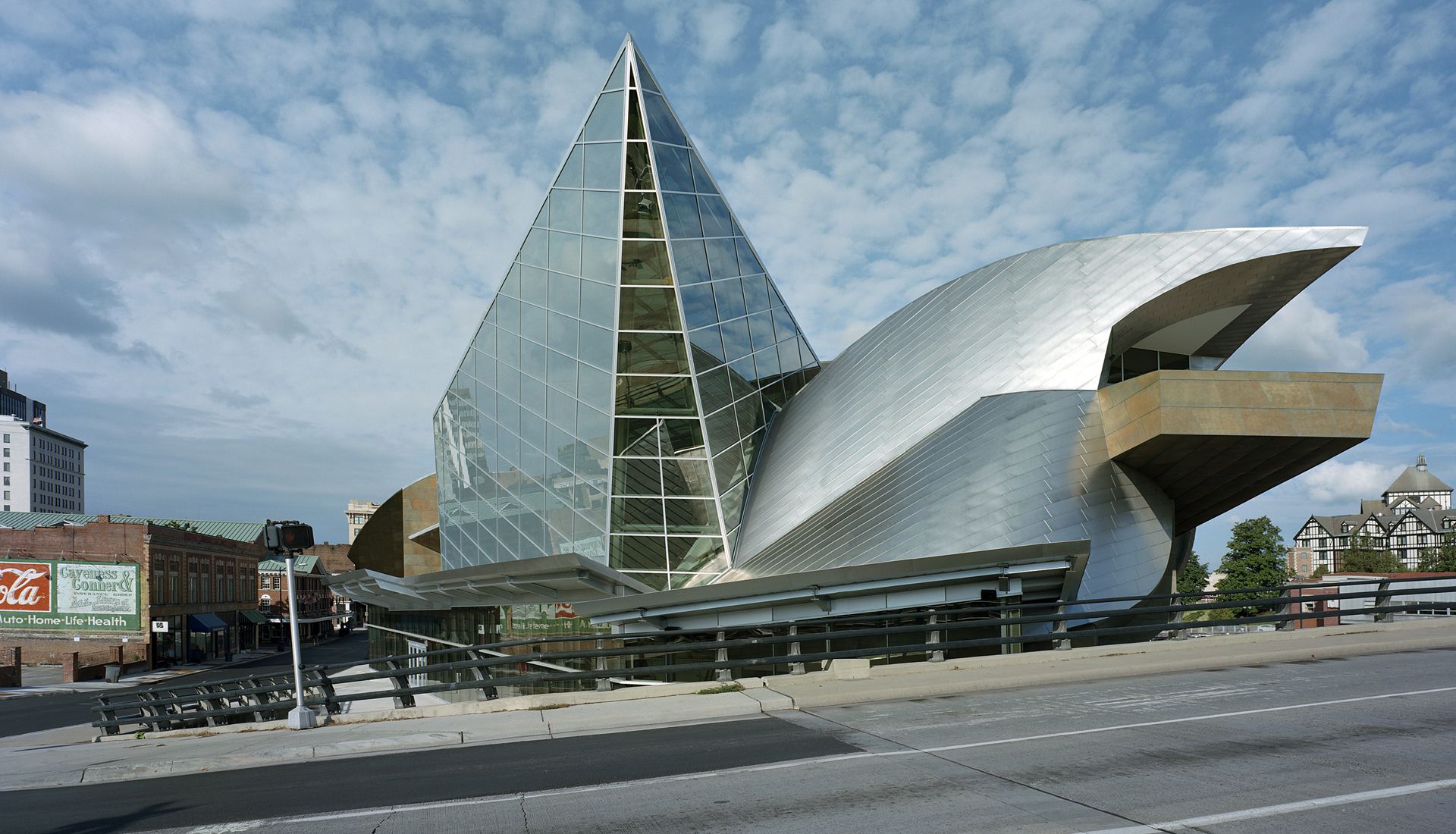
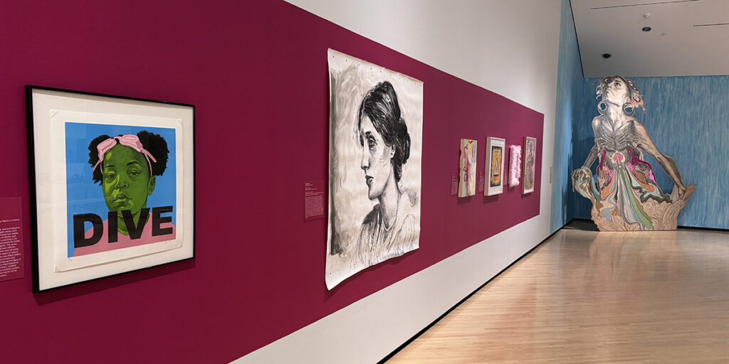
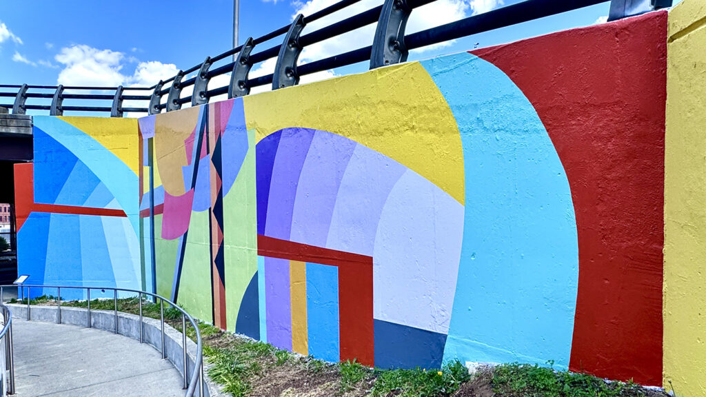
This is a Block Text & Image custom block. It has three content types: text, accordion, and text + accordion. You can align the image left or right. You can add a logo above the text block. You can change the background color and the button color. You can add a slanted edge above or below the color block. This block has a slanted edge, called a decorative element, below it.
Text in 2 Columns
Title Here
Lorem ipsum dolor sit amet, consectetur adipiscing elit, sed do eiusmod tempor incididunt ut labore et dolore magna aliqua. Ut enim ad minim veniam, quis nostrud exercitation ullamco laboris nisi ut aliquip ex ea commodo consequat. Duis aute irure dolor in reprehenderit in voluptate velit esse cillum dolore eu fugiat nulla pariatur. Excepteur sint occaecat cupidatat non proident, sunt in culpa qui officia deserunt mollit anim id est laborum.
Title Here
Lorem ipsum dolor sit amet, consectetur adipiscing elit, sed do eiusmod tempor incididunt ut labore et dolore magna aliqua. Ut enim ad minim veniam, quis nostrud exercitation ullamco laboris nisi ut aliquip ex ea commodo consequat. Duis aute irure dolor in reprehenderit in voluptate velit esse cillum dolore
This is the Title
This is a link
Block Presentation & Tour
This is an expanded exhibit info block. There are two content types: Presentation and Tour. You can change the background color. You can add a slanted edge above or below the color block.
Custom Block Type: Slider List Events – Make event covers 450 x 500
Custom Block Type:
Media Grid (two columns)

Title Goes Here
This is a versatile block that allows images and descriptions or embedded video, iframes, and native video plus descriptions.

Title Goes Here
You can change the block settings from two columns to a single column, which is used for Matterport videos.
Partners Block (Logo & List)
- List item goes here
- List item goes here
- List item goes here
- List item goes here
This block is for logo pages or text lists of sponsors. Logos can link out.
